

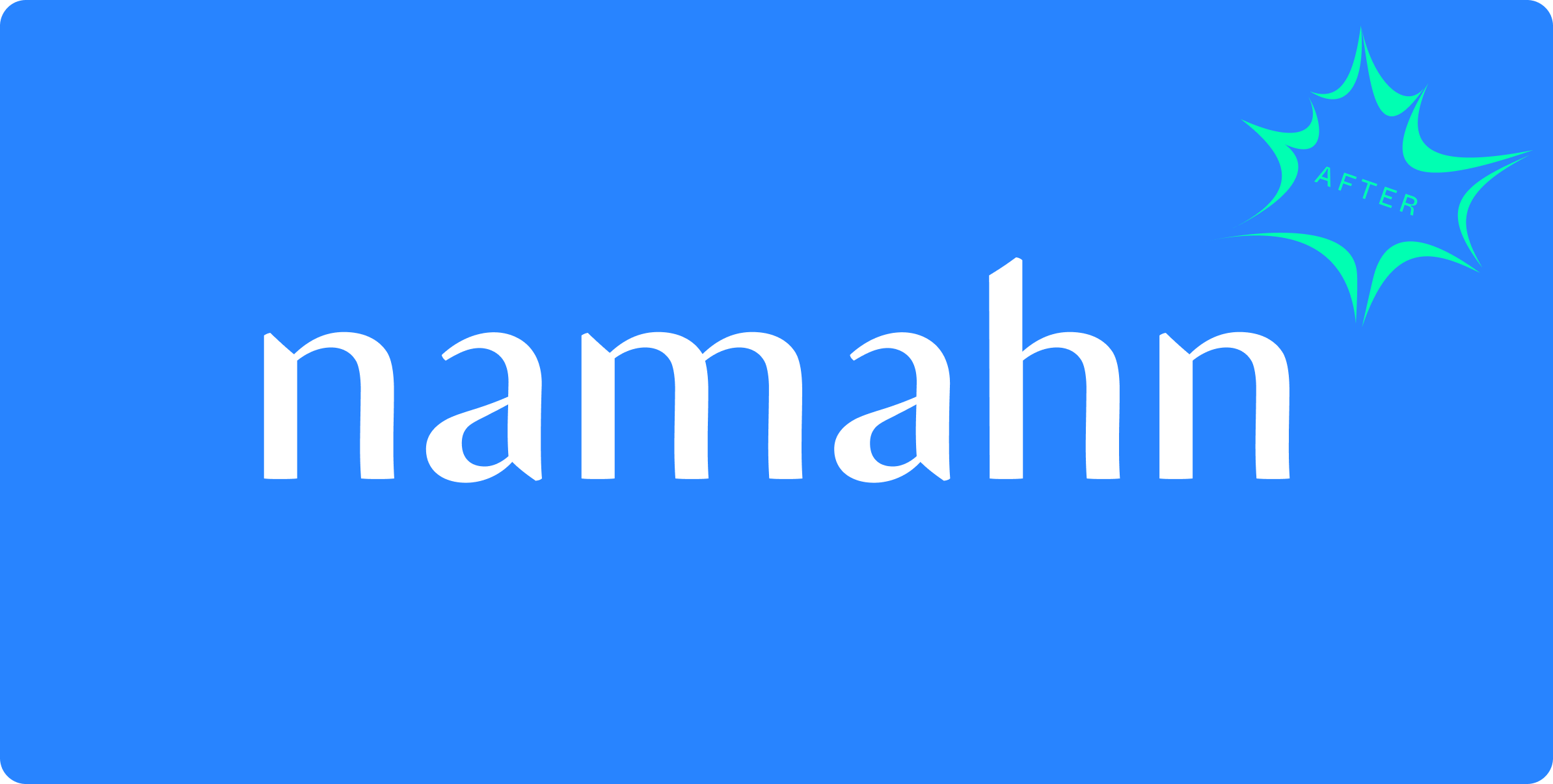

Designing a brand identity in co-creation
Project overview
Brand identity and graphic design disciplines are often influenced by individual tastes, trends, and personal opinions. The challenge of this project was to create a shared identity for Namahn with a clear design rationale, including and balancing the input of designers and of the market.
My role as a creative director was to create new branding assets in co-creation, create visual material with clear instructions, clarify the usage of the new branding, make available all resources for the company.

The process
Methodology
I used the approach of the design thinking methodology: the assets were defined through a series of iterations and tests, which validated and refined the direction of the graphic and identity choices in co-creation.
And of semiotic theories on brand identity: to translate abstract values into graphic and morphological elements, I created tools based on adaptations of semiotic theories. For example, I developed a tool that associates each brand value with a graphic element and helps prioritize sometimes conflicting or secondary values. This not only allowed to create graphic options but also to rationally justify the choices.
Approach
1. Assess Current Brand Issues: A co-creation activity to identify issues with the existing brand: the incomprehensibility of the logotype, difficulties navigating the website, the illustration style’s references to astrology, the color palette’s reference to the middle ages, etc. In general, the brand appeared snobbish, incomprehensible, and outdated.
2. Collect Insights about Identity CC: Define the values we want to communicate to the outside world. To accomplish this, we conducted a series of exercises to select, challenge, and prioritize these values.
3. Collect Insights about Trends and Market: This is a study phase to benchmark competitors and map existing and best examples, positioning Namahn in the market.
4. Translate Values into Assets: Connect each value to a visual element and create a style tile with a few graphic elements to represent different proportions of graphic elements.
5. Evaluate Style Tile CC: As a group, evaluate how the same assets can look different changing the colour proportion or the typography. We selected a style tiles according to the co-created values.
6. Define Touchpoints CC: Select and prioritize touchpoints to create detailed production planning.
7. Production: Color Palette, Logotype, Typography, Illustration Style
8. Test with ClientCC: Adapt touchpoints according to the feedback received.
9. Presentation of the colour palette, illustration style CC and logotype: I designed the logo using glyphs and I made it available as a font in two sizes regular and dispaly
10. Create a framework: Create a website to host and make available source files, to collect feedback and to organise materials
11. Organize the Production: Adapt all the touchpoints, search for partners to delegate the production of illustrations, and distribute and monitor internal production.
The deliverable
We delivered
*digital brandbook
*logotype
*colour palette
*illustrations library
*templates: approach, proposal, budget, etc
*gadget catalogue
*social media assets
*workshop material: booklet, flyer, tools, posters
☞ What I learn out of it
What I learned from this project
👉🏼 Brand is not the logo, not the palette, not the site, but it is the combination of all the instances that make the brand, paradoxically even the tone of voice of our communications or the designers themselves are instances of the namahn brand. Therefore, I have learned to justify every aspect of production and to present graphic choices in context, as if each were an ingredient meant to create the taste of a recipe.
👉🏼 Avoid the I like and I don’t like but structure a conversation around what works or doesn’t work. When talking about brand identity, people often feel personally involved in the choices made and tend to be emotional, therefore a big effort has been to structure the conversation on assets in a rational way.
👉🏼 I directly followed the production of the assets and the most relevant touchpoints, such as the logo, but I neglected the site due to internal dynamics and availability which is one of the most important touchpoints and is not consistent with the defined identity. so for the future to plan earlier in the project the resources staffed on the production and development of the touchpoints according to domain knowledge.
